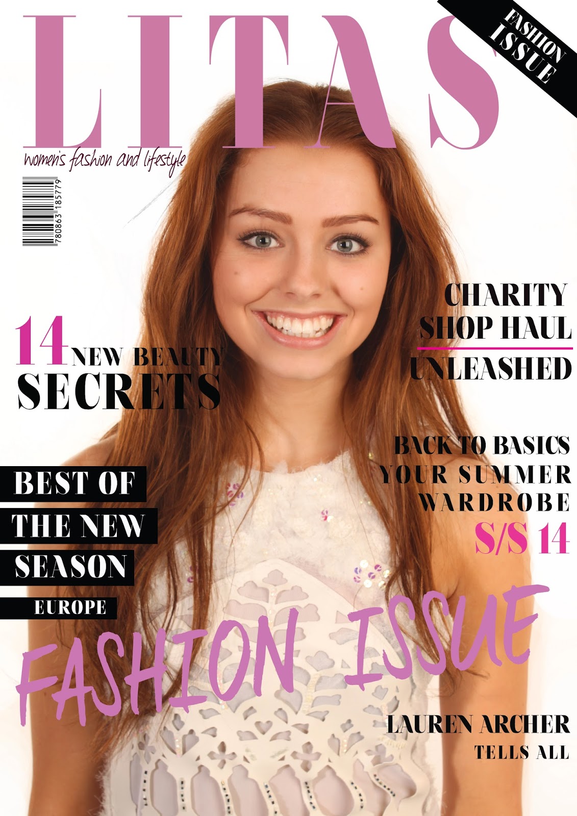
This is the first draft I made of my front cover. I had used a photograph I had previously taken in a photo shoot for my textiles AS level as I thought it was a professional looking photograph with good lighting and that the white dress would allow me to place sell lines on top and arrange them better. I looked at similar magazines from the genre such as Vogue and Harper's Bazaar to get a feel for their layout and the way they place their sell lines. I have included some of the covers I looked at in a post called 'Professional Front Cover Analysis'. I found that they put their main sell line in the same colour as the masthead and at the bottom of the page. They also used a different font which would be bolder at the bottom of the page which would draw the eye more. I decided to also use this technique. On some of the covers they also used blocks behind some of the text over darker areas to allow the sell lines to stand out more therefore I also used this technique when sell lines were placed over darker areas such as the hair of the model. I predominantly used bright pink, pale pink and black and white for the cover, this is because I did not want it to look too busy and for the colours to not compliment each other. I saw also that on Harpers Bazaar they used a sash across the top right hand corner and I thought this looked professional and effective as I have also seen this technique used on the covers of Vogue occasionally.
Once I had finished the first draft of this cover I decided that I did not feel it had the look I was going for and that the imagery did not look as dominant and effective as I had hoped for. Therefore I decided to take some more images in my next photo shoot which would seem more bold and dominant. I decided to use the same model however as I liked her look and style.

I then produced this magazine front cover after my photo shoot. I changed the imagery so that it looked more dominant and added a brush stroke to the background of one of the sell lines so that it could also stand out against the page. I used a different font for the main sell line at the bottom of the page as I did not feel it stood out off the image and with it being the main sell line it needed to be bolder. I then produced the second draft of my front cover which I feel looked more dominant and bolder, I also thought this looked more professional and more like the professional competitors.

Eventually, I had produced my final draft of my front cover. I kept changing and adding more sell lines so that it looked more professional and like a real magazine, I also changed the depth of colours used, I decided to go for a deep purple for the masthead and main sell line as it looked more dominant and stood out better off the image background as this was hard to do due to the big hat used and the patterned shirt the model was wearing. I again changed the font of the main sell line to something younger looking and bolder and added a thin white stroke so that it again stood out better off the image. I then added little details such as lines and crosses to add more detail to some of the sell lines and I changed the colours of some of the sell lines to the pink colours so that they still fit in with my house style. Overall I am very happy with my front cover and I think it looks effective and like it could compete with the professional ones I have used as inspiration.


