Friday, 28 February 2014
Wednesday, 26 February 2014
Charity Shop Haul Article
If you were given
15 hours to find a full, elegant, designer esque outfit for under £60 where
would you turn? Surely not a charity shop…surely yes! Charity shops are being
vamped up and aren’t as tatty and shabby as before, you could even find
yourself blissfully near charity-shop nirvana. London obviously have the best
charity shops, such as TRIAD and Salvation Army on Princes Street, however
finding a little designer number in one of these will probably cost you a small
fortune. A vintage Chanel can knock you back a few hundred pounds, so for now
let’s stick to the non-major branded items. Admittedly, unless you’re followed
by a fairy sprinkling magic dust, you will never find an excellent charity shop
item at the click of your fingers. A little hunting and imagination will get
you a long way. Open your mind, walk aimlessly and look for inspiration!
Your first time
charity shopping can be a little frightening and disappointing, but the key is
to not give up. Look through all of the items on the rail; you never know what
may be lurking out of view. If something takes your eye, take it down from the
rail and inspect it. Think of things you already have in your wardrobe you
could team it with or what trend it will categorise under. If you can imagine
yourself wearing it or have something to team it with, buy it. If you can think
of a way to up-cycle it and make it more your style, again, buy it. Each item
will only knock you back £2/£3 at a time, it won’t break your piggy bank!
I met up with a few
friends and asked them all to go to a charity shop, hunt around for 15 minutes
and bring me back an item they would wear. One brought back the cutest, crochet
white, halter neck summer top. With her slim-line, tall, slightly sun-kissed
skin she looked to die for. Another brought back a pair of Levi jeans which she
admitted she added a few rips to, so that they looked more vintage and up to
date with the latest trends. Ripped jeans are big this season so grab yourself
a cheap pair from a charity shop and get ripping! (Psstt..I will show you how
to later on). Two of my friends brought back scarfs, one tartan and one
burberry, which were both massive trends winter 13/spring 14, they had
successfully found excellent, cheap items which were made of rich fabrics for a
tiny price! What could possibly be more great?
Statement Pieces Article
Razzle Dazzle;
An array of
shimmering sequins, beads and all things blingy, you’re bound to cause a scene
and stop traffic passing you on the streets! Follow the designers such as Tom
Ford and Stella McCartney who are making sequins a massive part of their AW14
collections. Embellishment enriches our wardrobes, whether it be day or night. From
barely there glimmer, to a heavy sumptuous sparkle, the entire collection offers
up a rich feast for the eyes. It’s such a lust affair!
Designer and high
street brands both have created some lavishly detailed pieces over the years,
however AW14 will be the time to shine! From a twist on the basic camisole, to
prepped up sport wear, sequins are set to drop a big bombshell on the fashion
world. The thirst for shimmer will be immense, so grab some sparkle while you
can. All aspects of the colour spectrum are allowed for this trend, however
pastels are set to be a big hit.
Why not glitz up
one of your old wardrobe items using craft shop beads and sequins to make a
totally special piece, nobody else in the entire world will be rocking? Now that’s
fashion. Grab an old shirt with a collar and a couple bags of sequins and beads
and a tube of fabric glue and hey presto, you’re already on your way to
creating an iconic statement piece. Glue on the sparkles one by one ensuring
you fill all the gaps causing big clusters for maximum impact. Why not arrange
in a pattern to gain a higher quality effect?
The Colourful Collarless
Coat;
The intense
coloration of luminosity and undertones are vital to pull off this key trend of
AW 14. What’s a coat without colour? The BRIGHTER the better! Whether it be
used to shield the harsh winter wind or a nippy spring breeze a bright,
collarless coat is vital. Deep saturation is better than muted undertones for
this trend, ten times over. Chanel and Lucas Nascimento are big players of this
trend. Chanel uses a lot of bright tweed fabrics, which look like they have
just stepped off a plane from lux city. What a way to lure us in! Celebs such
as Rihanna have also been spotted sporting this trend on the streets of
Hollywood, so it’s sure a trend us aspiring fashion legends are going to chase!
Both designer and
high street brands are nailing this trend. Topshop is currently a big lover of
the colour spectrum coat ranging from £70-£100, a little pricey but for a key
fashion item I’d say it would be an excellent investment. For a cheaper
alternative for this trend, why not visit your local charity shops or your Grandma’s
closet. Bright coats have been around for centuries drifting in and out of the
fashion spotlight however we think this time they’re here to stay. The heavier
the fabric the better, however any fabric can still be made to look
ostentatious! £10 in a local charity shop could get you a fabulous, out dated
coat which, with a little TLC, could look brand new again. How about adding new
buttons to give it a richer looking effect?
Thursday, 20 February 2014


Monday, 17 February 2014


Sunday, 16 February 2014


Risk Assessment QE Studio
Hazard: Cables
What
is the likelihood of this happening? Unlikely however it is possible
How
much harm? Could cause someone to trip which could lead to little pain, a
sprain or broken bone
Apply
the following priorities, how will this risk be managed (provide detail)?
Control – this will be done by ensuring that all
cables are not loose and the walk ways are clear so that the risk is very
unlikely of them to be near any cables.
Hazard: Lighting
What could cause harm? The flash lighting could
cause harm to the eyes, lamps are very hot so when adjusting them they may get
burnt
What is the likelihood of this happening? Unlikely
How much harm? This could cause pain and potentially
blindness, scarring and burns
Apply the following priorities, how will this risk
be managed (provide detail)?
Reduce
or substitute – to reduce the risk of damage occurring is to have a low flash
lighting setting on the lights to reduce the harshness of the flash when the
photographs are being taken, also to keep the models in as similar place as
possible to reduce chance of having to reposition the lights
Hazard: Electricity
What could cause harm? The plugs from the equipment both in and out of use, could be plugged in
and not in use, could have plugs lying around with the potential to stand on
them
What is the likelihood of this happening? Unlikely
How much harm? This could lead to slight pain, electric
shocks, and potential big damage
Apply the following priorities, how will this risk
be managed (provide detail)?
Eliminate
& Control. – this will be controlled by ensuring that all electrical items
if in use are plugged in with the switches off until they need to be turned on
and fully in use, also ensuring that anything electrical not being used in the
shoot has the wires and plugs wound up and placed in the corner out of the way
of any walk ways.
Recce
Friday, 14 February 2014
Monitoring Post 14/02/2014
-
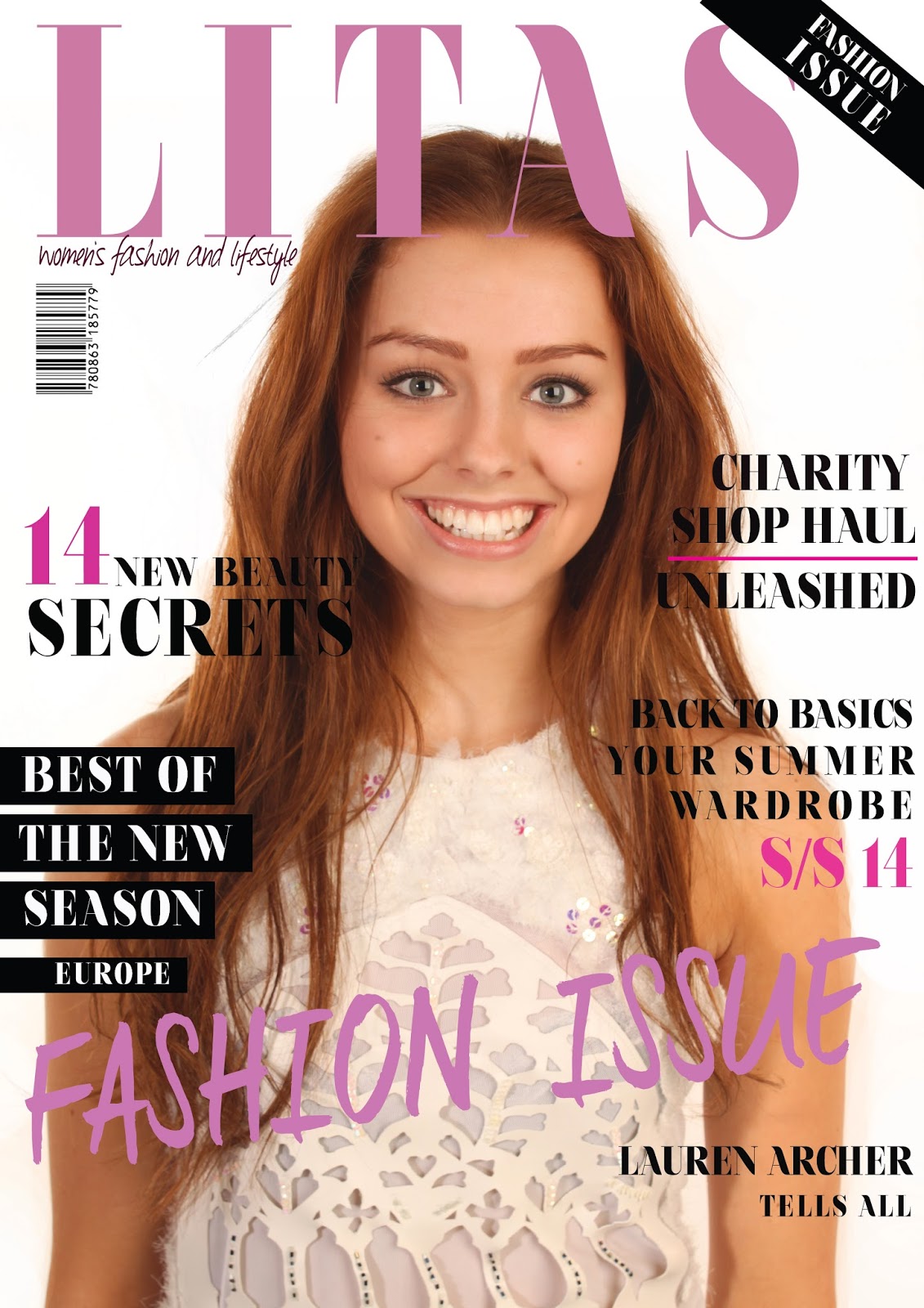
Last week I had successfully made two solid first drafts of my two feature DPS's like scheduled therefore I was still on track due to my schedule which meant this week I would focus my production on my front cover and contents page. I have already set up the Photoshop documents for both of these pages with the layout boxes on my contents page ready to input text, mastheads and photographs. I scheduled to start the week focusing on creating a solid draft of my front cover with all of the main elements included and move on to the contents page at the end of the week, I plan at sticking to this however I may use some of the longer lesson on friday to continue with the front cover. I had the photoshoot for my front cover and other elements of the magazine on friday and I felt this was the most successful photo shoot I have done for the magazine. I shortlisted some images I could use for the front cover over the weekend to give me a head start and I am pleased with the high quality of the images, they look very professional. I had previously taken some images in one of my other photoshoots for another DPS however I did not feel it had the look I was trying to achieve therefore I thought setting up another photo shoot and finding inspirational fashion photography images to work from was the best option. I have included a blog post called 'Front Cover Photoshoot Images' where I have shown the shortened list of images. I chose the strongest image to use for my cover considering pose, shadows and facial expression. I started Monday's lesson by editing and airbrushing the photograph to use for the background and I then set that in to place on the document. I then layered on top the masthead, fiddling with the width, depth and size of the font to get it to fit proportionally across the top of the page without covering too much of the models face. I then started to add all of the individual sell lines onto the page and rearrange them accordingly. I then added more layers such as blocked boxes for behind text and brush smudges. I changed the colour of some sell lines and the masthead. I spent monday's lesson and another 1hour 30minutes on monday creating the first draft. I was happy with the draft I had created however I did not feel it was as empowering as I had expected therefore I decided to make another draft and change the colours, layout of the sell lines and some fonts to create a more powerful cover. I spent Tuesday's lesson and another hour re-creating this draft. I then asked some peers from within my target audience which they prefered. All of the people asked said they prefered the second draft therefore I decided to stick with that as a solid first draft. In the last half of the week I moved on to create a solid draft of my contents page. I included images from my different photoshoots in a mosaic pattern onto my contents page and added the masthead and text. I also used some images from online to create a more professional look. Overall I feel that I have been successful this week in production. I have created two good first drafts of a front cover and a first draft of a contents page. This means that I am on track with production and are scheduled to be finished by the deadline. My homework for this week is to print the drafts and gather some quick feedback. However I have also done this within my lesson time therefore I will not need to be doing this as homework this week.

Here I have shown some of my experimentation with different colours and fonts for the sell lines. At the end of this week I had came up with a good solid first draft of my front cover.

Wednesday, 12 February 2014
Professional Front Cover Analysis


Here are just a few of the magazine front covers I looked at and used for inspiration. Something that was typical from the brand on their covers was the main sell line at the bottom of the page in a big bold font, I thought this was really effective and that it was something I would use in my magazine. Also they placed the sell lines typically down the left side of the page in a line and had some additional to the right side, I also thought this looked effective and would be a method I would use when designing my magazine cover. They also used the sash across the top right hand corner of the page and i thought this added a special touch to the magazine and made it look more professional therefore I too decided to use this in my magazine.
Tuesday, 11 February 2014


Friday, 7 February 2014
Monitoring Post - 07/02/2014
-
This week I have planned to have 2 out of 3 articles to be nearly finished and at a high, professional standard so that I can gather some feedback from my peers and target audience about what they think of the articles and if there is anything they feel needs a massive change. Throughout the week I will be continuing to create the secondary elements of my pages. I will spend two lessons on each of the article pages to ensure that I am spreading my time across them to ensure that I am completing all of the DPS's in plenty time to make professional touches and have time to make any needed changes before the deadline. I will be focusing on the new DPS's Charity Shop Haul and Statement Wardrobe Pieces building up the layers to create depth and a professional finish. I decided to use a three page scheme for both of these DPS' to give them a different edge and so that I could show off some of my skills on Photoshop and introduce a fun, yet high fashion edge to my magazine and it's articles. I chose to spend monday and tuesday's lessons creating more layers and adding the body article text and basic images to Charity Shop Haul. I edited the photograph which was to be used on the opening page to the DPS and introduced the masthead and introductory paragraph on this page and that was quickly finished within 30 minutes, however I feel I have still completed this page to a professional standard. I had layered up images to create a background in a circle then layered my model on top to create a fun edge. When I showed this to my peers they all said they liked the idea and thought it looked professional. I then proceeded to add the main body text and main imagery into the already placed layout boxes onto my documents. This would give me the base layout to work with and layer up to create a professional finish. I added mastheads, introductory sentences, smudge brush marks and quote inserts. These are all of the basic things to add which will make the magazine look more professional before adding the finishing touches. I then realised that I did not find the imagery effective therefore I will be taking out the photo shoot again in the up-coming days to then place into the article and add with the final finishing touches. On Thursday and Friday I then moved onto the Statement Wardrobe Pieces article which I also decided should be a three page article for effectiveness. I have been using pattern making skills on Photoshop in my Textiles AS course and I decided to use this technique on the introductory page of the article as similar things have been used in Company and Vogue magazine however nothing as effective as this. I decided to twist the images of the models taken to make a large distorted flower shape out of their bodies which I would use as a feature of the opening page for flicking appeal and to draw in the readers attention to stop and read what the article is about. In these lessons I also started adding all of the basics and the extra layers to the Statement Wardrobe Pieces article as I did with the charity shop haul article. I had a solid structure of both of the DPS's finished by the end of the lesson today which meant that I was on track and I feel like I have made a lot of progress this week and are well on the way with producing a solid, professional looking final piece. The homework for this week was to finish writing article three and input it into the InDesign document. My main target for this week was to have a solid draft of articles 2 and 3 and I feel that I have successfully done that.

Monday, 3 February 2014


Subscribe to:
Comments (Atom)