-
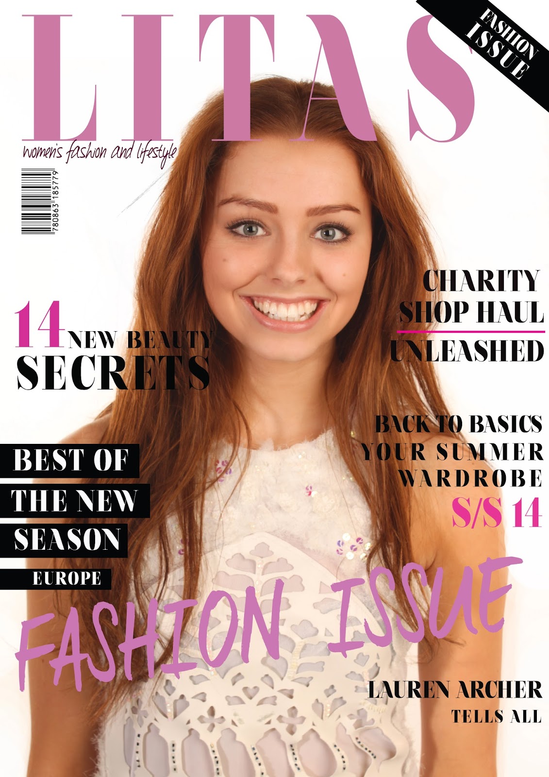
Last week I had successfully made two solid first drafts of my two feature DPS's like scheduled therefore I was still on track due to my schedule which meant this week I would focus my production on my front cover and contents page. I have already set up the Photoshop documents for both of these pages with the layout boxes on my contents page ready to input text, mastheads and photographs. I scheduled to start the week focusing on creating a solid draft of my front cover with all of the main elements included and move on to the contents page at the end of the week, I plan at sticking to this however I may use some of the longer lesson on friday to continue with the front cover. I had the photoshoot for my front cover and other elements of the magazine on friday and I felt this was the most successful photo shoot I have done for the magazine. I shortlisted some images I could use for the front cover over the weekend to give me a head start and I am pleased with the high quality of the images, they look very professional. I had previously taken some images in one of my other photoshoots for another DPS however I did not feel it had the look I was trying to achieve therefore I thought setting up another photo shoot and finding inspirational fashion photography images to work from was the best option. I have included a blog post called 'Front Cover Photoshoot Images' where I have shown the shortened list of images. I chose the strongest image to use for my cover considering pose, shadows and facial expression. I started Monday's lesson by editing and airbrushing the photograph to use for the background and I then set that in to place on the document. I then layered on top the masthead, fiddling with the width, depth and size of the font to get it to fit proportionally across the top of the page without covering too much of the models face. I then started to add all of the individual sell lines onto the page and rearrange them accordingly. I then added more layers such as blocked boxes for behind text and brush smudges. I changed the colour of some sell lines and the masthead. I spent monday's lesson and another 1hour 30minutes on monday creating the first draft. I was happy with the draft I had created however I did not feel it was as empowering as I had expected therefore I decided to make another draft and change the colours, layout of the sell lines and some fonts to create a more powerful cover. I spent Tuesday's lesson and another hour re-creating this draft. I then asked some peers from within my target audience which they prefered. All of the people asked said they prefered the second draft therefore I decided to stick with that as a solid first draft. In the last half of the week I moved on to create a solid draft of my contents page. I included images from my different photoshoots in a mosaic pattern onto my contents page and added the masthead and text. I also used some images from online to create a more professional look. Overall I feel that I have been successful this week in production. I have created two good first drafts of a front cover and a first draft of a contents page. This means that I am on track with production and are scheduled to be finished by the deadline. My homework for this week is to print the drafts and gather some quick feedback. However I have also done this within my lesson time therefore I will not need to be doing this as homework this week.

Here I have shown some of my experimentation with different colours and fonts for the sell lines. At the end of this week I had came up with a good solid first draft of my front cover.

No comments:
Post a Comment